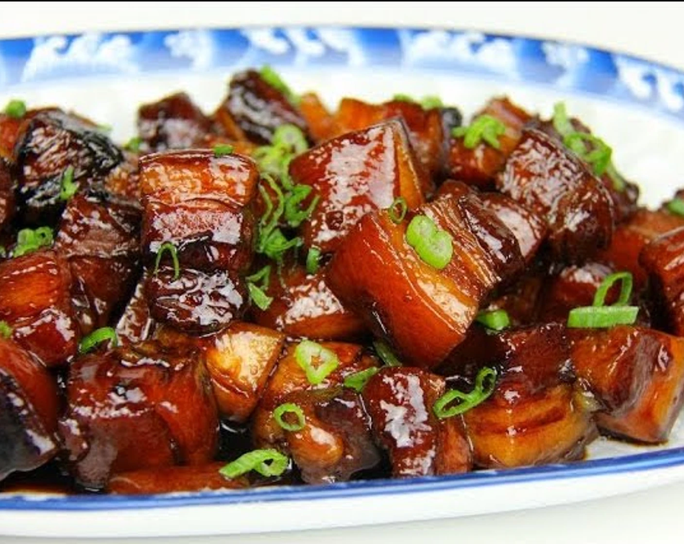
This site offers a detailed explanation for cooking braised pork belly, with pictures included for each step. It also includes a checklist for ingredients and instructions at the end.
However, betweem each step, the site could provide clearer visual indication to inform the users that they have entered the next step. Also, the actual content only takes about half of the screen, while irrelavant advertisement takes the rest.
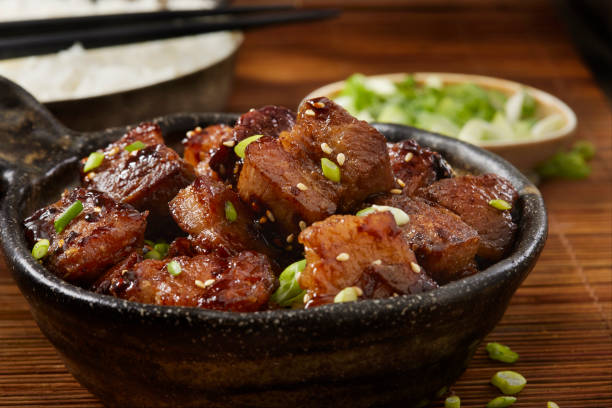
This site is more visually concise and clear. It not only clearly labels step by step instructions and ingredients, but also provides active and total preparation time.
However, it would be better if they could provide some pictures for each step so that it would be easier for users to follow.
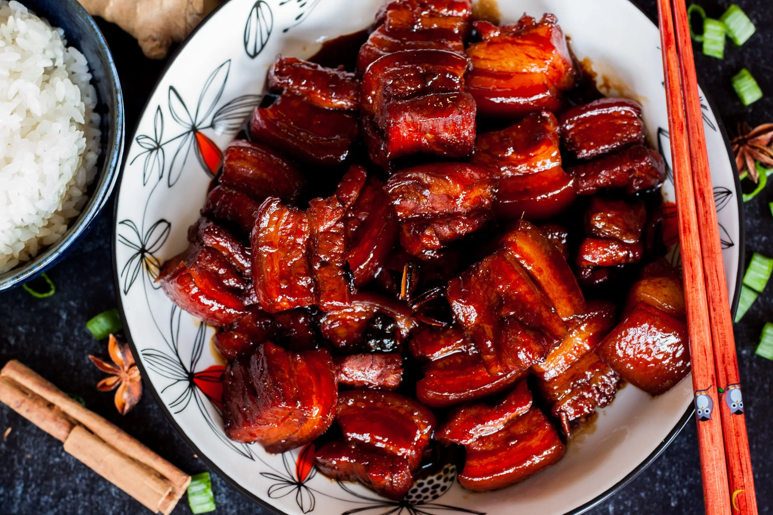
This site provides a more detailed explanation into the background of braised pork belly. It also includes references to similar dishes for interested readers. In addition to concise instructions, the author provides kindly notes to help first-time cookers.
This is an installation manual for bikes. I like its clear document design because it uses levels of headings to indicate each step. Within each step, it also includes sub-titles that users could refer to if they get lost. I could utilize this type of document design for my recipe site.
This is a set of api documentation for Google Firbase services. It uses both a top and a side nav bar to help user to easily reach the information they want.Even though my site won't have as much information as google, I could still implement a similar nav bar to help users navigate between different sections of the recipe.
For each property listed in zillow.com, a set of key characteristics are listed beside an image gallery. This two column layout is very visually appealing. At the same time, it also effectively converys essential information that users want. I could apply a similar design for my recipe. When users browse through the image gallery of braised pork, I will also include some key information on the side.